PORTFOLIO & CONTEXT
PART II
- 9 images as an online portfolio;
- RAW & JPEG;
- 300-word personal statement describing the motivation, genre, and ambitions for this work to be presented to an industry professional alongside your portfolio images.
ARTIST RESEARCH
Paolo Roversi

Paolo is an Italian-born fashion photographer based in Paris. His work is featured in high-fashion brand names, magazines, and museums, and he has also photographed many fashion icons such as Naomi Campbell and Kate Moss. He is known for his unique style, often making use of the light painting technique.
Paolo uses a Deardorff 8x10 (large format) and also a Polaroid, hence these images are taken on film, and shot in a studio using a flashlight.
The images consist of portraits of different models posing in various ways, such as sitting down, arms crossed, or in motion to create a sense of movement.
The images showcase heavy, even tones and enhanced contrast to distinguish the subject from the background, except for the first image, where the intention was to blend the subject and create a double exposure effect.
The first two images feature cool tones such as blues and dark greens, while the last two images have warm tones like oranges and yellows. All images appear saturated but with a washed-out look. The images are edited and clean, although due to the use of double exposure, some areas might appear blurry.
I particularly admire the background of the second image, appreciating the faded color and texture, that is one of the reasons why I selected these images as well because of the technique Paolo utilizes in some of them (first and last), which suggests movement, a feeling. Additionally, is very eye-catching to me the way he edits his photos, playing with hues and contrast.
Very nice interview by Aenigma Images with Paolo Roversi:
https://www.aenigma-images.com/2020/09/paolo-roversi/
Sarah Moon


Sarah Moon, a French photographer who began her career as a model, and transitioned into fashion photography in the 1970s. Since then, she has dedicated herself to fashion, galleries, and film work.
Her preferred cameras include a simple Polaroid pack film camera and Polaroid Type 665 film (medium format), as well as a Nikon Type 55 film (35mm).
The grainy texture of film and her frequent use of Polaroids are clear in her work. The images appear to be taken on location, characterized by their quality, natural lighting with occasional use of flash (camera), and the subtle presence of the surroundings, hinting at a backdrop that complements the overall aesthetic.
Sarah Moon is renowned for her signature blurred style, using mediums and techniques such as Polaroids, halftone photos, and the partial erasure of faces, as seen in the selected photographs.
I appreciate the simplicity in the composition of her images, which are elevated by elements like blur, motion, and complementary colors, resulting in a captivating visual experience for the viewer.
The images exhibit heavy, even-toned grading, accentuated contrast, and a high level of saturation, featuring cool tones ranging from greens to blues.
Among the selected images, the texture and colors of the third photograph particularly resonate with me. The model's pose, highlighted by the outlined face contrasting with the background, adds depth to the composition and reinforces its appeal. I am drawn to experimenting with motion and blur in my own work, inspired by Moon's approach.
Additionally, exploring the interplay of complementary colors and their impact on the overall narrative, I am eager to experiment these techniques into my artwork.
PORTFOLIO MOODBOARD

Overall, the mood board reflects my lighting inspiration for the photoshoot, which revolves around light painting, a photographic technique I learned in one of the workshops we had recently.
I was blown away by the endless possibilities this technique offers and the fact that each outcome is unique in its own way and that it cannot be replicated at all, really excites me to take more photographs.
I don't have a specific composition in mind; I think having a variety will help me figure out what works best for the portfolio. But that said, I'm kind of leaning towards full-body portraits because it will show the clothes more, which adds depth and meaning to the concept of the photoshoot, apart from just using props and coloured gels. Color grading is definitely a key factor as it sets the mood for the photos.
Drawing inspiration from spring and autumn, I'll need to consider which colors complement each other to evoke the seasonal vibe and resonate with viewers. I'm thinking of pink and green for spring, as I always loved that colour combination, and brown-warm tones with yellow and orange to set the autumn feeling.
LIGHTING DIAGRAM
Two lights with gels. One flashlight facing the colourama, and one continuous light facing the subject (can change into flashlight if needed.)

EQUIPMENT LIST
- Nikon D850
- Lens 24-120mm
- Torch
- x2 ELB 500
- x2 c-stands
- Tripod
- Colourama: Fern
- Gels: pink, green, yellow, orange.
CALL SHEET


CONTACT SHEET

SELECTED


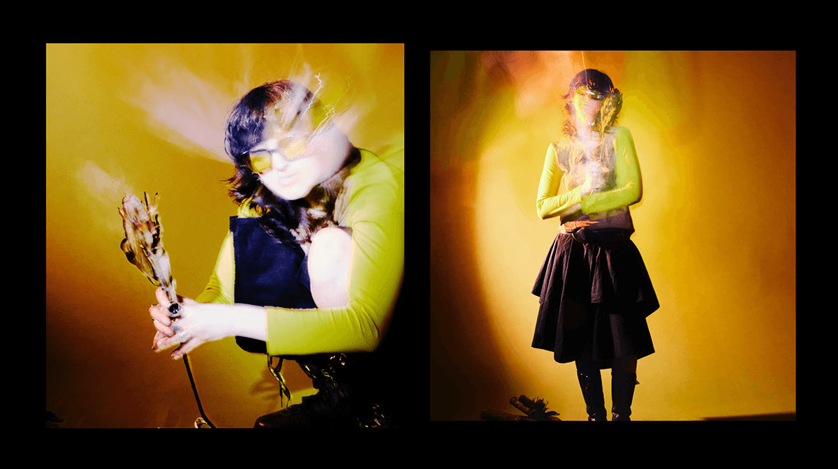
POST-PRODUCTION / FINALS


When editing the photos, I didn't do much since I was already quite pleased with how my originals turned out, this was hanks to the light painting technique and gel color choice. So, I just enhanced the contrast, exposure, and highlights using the curves tool on Photoshop.
Additionally, I sharpened some areas that needed more definition and cleaned up minor details like unwanted lights, leaves and backdrop.
SELF-REFLECTION
The lighting setup worked very well, and I managed to achieve what I wanted with just two lights. I used gel colors pink and green for spring, and yellow and orange for autumn, along with a fern-colored colorama that complemented autumn nicely - I was worried that the gels wouldn't evoke enough of an autumn vibe, but it worked out well.
I shot in portrait mode using a tripod, which made it easier for me to do the zoom in/out technique to create a sense of movement and double exposure. I also used a torch simultaneously to lighten up certain areas and details.
Overall, the shoot went smoothly, and I was very happy with the outcome. However, I wish I had brought more props, such as dried leaves (for autumn), to better convey the concept.
This feedback came from my tutor, Ellen - She suggested I increase my f-stop to around f/22 for a clearer depth of field so the whole subject is on focus.
Moreover, for next photoshoots I need to think of more interesting poses that align with the concept, if possible.
PERSONAL STATEMENT
As an artist, I am deeply committed to infusing my work with meaning and emotion, creating images that vibrate with viewer. So far, my journey in photography has led me to explore various techniques and styles, although I recently have been amazed with the art of light painting technique. I got into light painting because it fascinates me the enchanting appeal of light painting and the capacity it has to immerse subjects in vivid hues and motions. Therefore, I then decided to create a series that captures the essence of Spring and Autumn, through artistic fashion photography.
While my recent focus has been on light painting techniques, I am eager to expand my abilities and search into location photography. I am drawn on to how natural surroundings and artificial light sources mix and play together.
As I enter my third year, my goals are to improve my skills in studio and location lighting, experimenting with innovative techniques to create compelling visual narratives, know how to communicate better with the subjects to achieve my vision and a really good understanding of Photoshop, Capture One and InDesign softwares that can give me more opportunities in the industry.
Another goal, as I finish my second year is to be fully committed to meticulous planning, curating mood/vision boards to ensure that every aspect of the shoot contributes to the desired atmosphere.
In essence, my work is a reflection of my passion for visual arts, creating storytelling through imagery, capturing moments that feel like they are beyond time and space, with eye-catching hues.
With each photograph I take, my attempt is to convey the beauty, complexity, intricate and poetic the world is, inviting the viewer to dive into the colourful mix of human life.
IMAGE PORTFOLIO